Can I See The Less Successful Graphs?
A Mosaic Chart of Donors' Professions
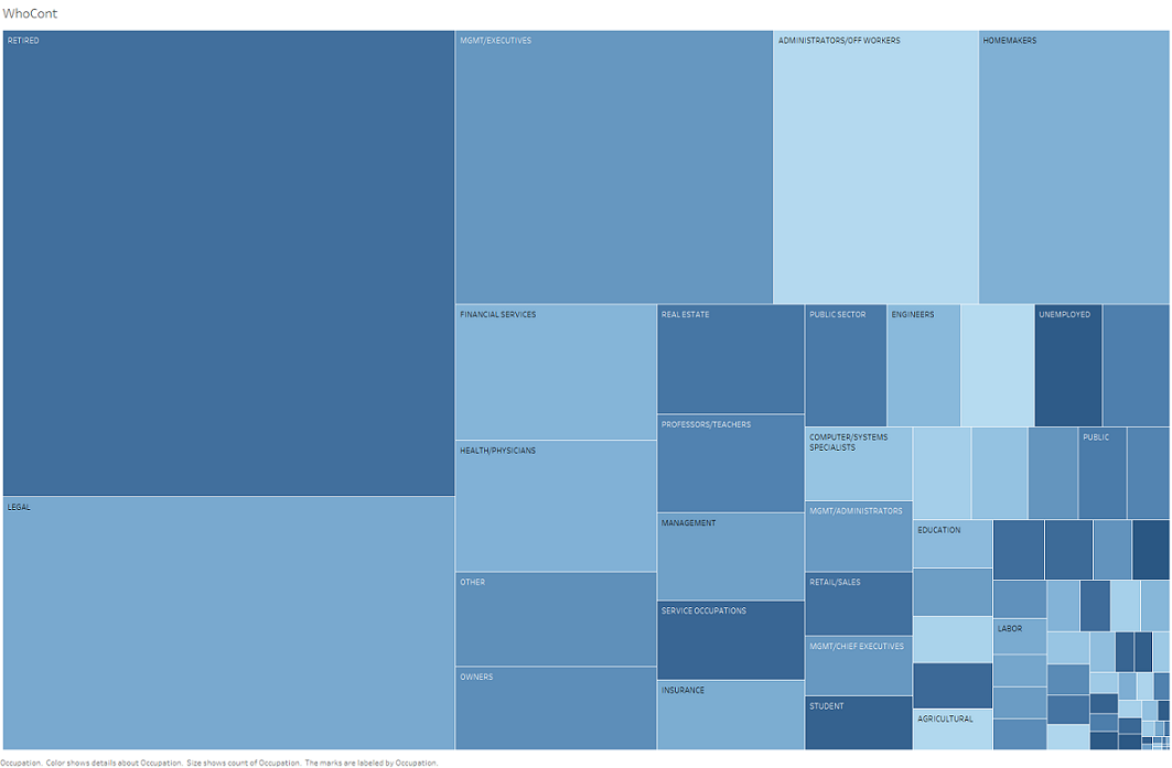
This was an early attempt to show the professions of the donors. It is effective in showing which professions donated more money to gubernatorial campaigns in general. In some ways, it is actually a bit clearer than the Mosaic Display of Donor's Occupation and Donation Amount, the visualization I ended up useing, in showing what professions contributed more. However, unlike the Mosaic Display it does not show approximately how much money was donated by each group of professions. Furthermore, some professions do not get their name on the box if they did not donate enough money, a problem the Mosaic Display does not really have. While some of the smaller professions are hard to read on the Mosaic Display they are at least labeled, unlike the Mosaic Chart. Finally, I also already had two other Mosaic Charts so was looking for a more interesting graph. The colors do not really represent anything, they were just added in an attempt to make the chart clearer.
Return Home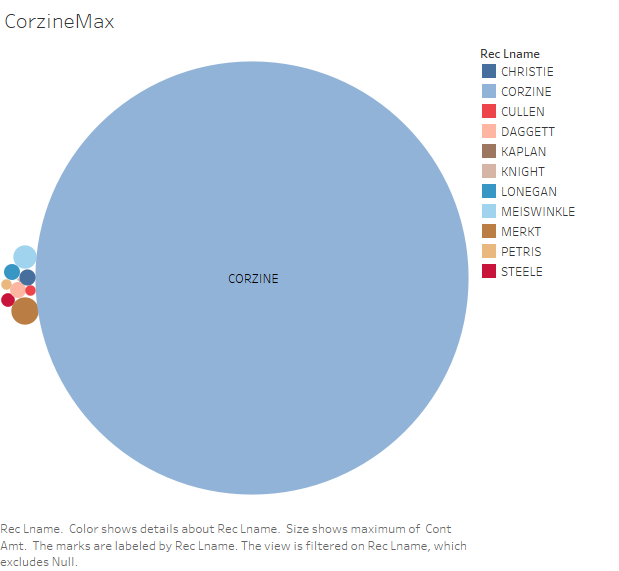
A Packed Bubble Chart Showing The Maximum Donation Made to Each Candidate
This packed bubble chart is the first version of the Packed Bubble Chart Showing The Maximum Donations Made by Contributors to Each Candidate and Abot How Many People Contributed to Each Campaign. While it did show just how much more money Corzine gave to his own campaign than anyone else Corzine’s bubble was almost too big to accurately gauge what anyone else did. Also, all other candidates’ largest donors were capped by contribution limits which, since he was giving to his own campaign, Corzine did not have to deal with. Finally, it did not show how many people actually gave money, just who gave the most. One candidate getting large donations from a few people would appear stronger on this chart than a candidate who received many little donations even if the candidate who received many little donations actually ended up getting more money in the end.
Return Home
A Box Plot of Contributions and the Year of the Contribution
This box plot was an early effort to see when approximately people donated to campaigns. It was also meant to show about how much money people gave. Since there were some extreme outliers, like Jon Corzine, and large refunds that get counted as negatives, the box plot did not show how much money people donated very well. Only having the year also does not tell you very much about when something happened too. However, it was helpful in pushing me on the right track to see what the massive early outlier was. I originally thought it was an error but later research shows that it was Jon Corzine.
Return Home